AirlineDelays
Analyzing Airline Delays
Tools: Tableau & R
Dashboard: Tableau Dashboard
Data: Bureau of Transportation Statistics (BTS)
Reference: Hex-Maps in Tableau
Objective: Analyzed airline arrival statistics by state/region, carrier (Delta, SouthWest, etc.) to identify carriers and regions with poor service
Note: An airline is reported as a late arrival if the actual arrival time is more than 15 minutes after its scheduled arrival time
Findings:
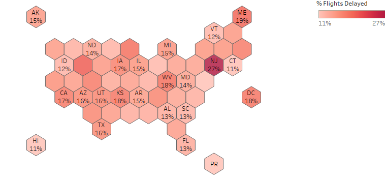
- New Jersey had a 27% arrival delay rate in November 2024, nearly twice the national average (14%). Regarding the cause for delays, 63% were due to the National Air System (NAS). This was driven by FAA staffing shortages at Newark
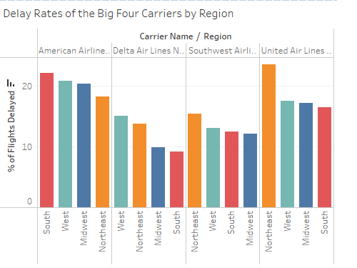
- Delta outperformed the other big carriers (American Airlines, SouthWest and United) with a 11% delay rate. Delata outperformed its competitors across regions
-
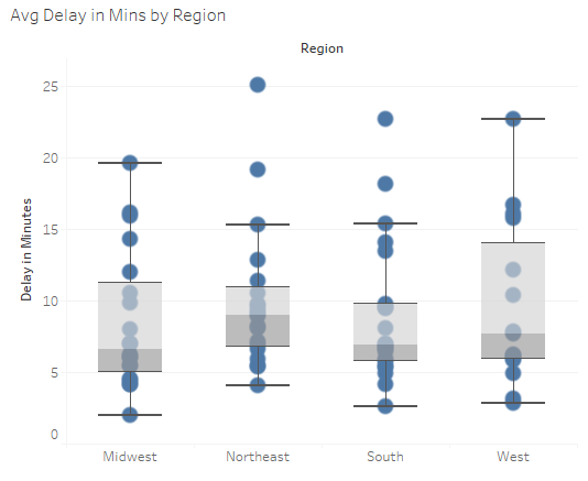
While the northeast region had a higher median delay (in minutes), it had the lowest variability in delay times
Next Steps: Create a month-over-month view using past data to determine seasonality and forecast delay times.